2018ALYNN
A responsive website redesign
for an apparel company.

Project Overview
How do you design an online experience for a newly launched apparel company, that conveys its unique value proposition while also providing the groundwork for further growth of the company? A. Lynn is a fashion e-commerce brand that offers more sizing options than department store brands. A. Lynn’s founder approached our team to help address usability concerns with her company’s newly launched e-commerce website.
The Brief
Find pain points for users visiting A. Lynn’s website and make redesign recommendations for a responsive website. A. Lynn’s founder was concerned about a high bounce rate on her homepage, and wished to add a “fit calculator” feature to help simplify the current Fit Guide & Starter Kit process.
The Team
Meghan Salviejo
Research & UX/UI Design
Client POC
David Gonzalez
Research & UX/UI Design
David Sainté
Research & UX/UI Design
UX Tools & Methods:
Research: Heuristic Analysis, Competitive/Comparative Analysis, Market & Industry Research, Feature Analysis, User Interviews, Usability Testing, Affinity Mapping, Persona Development
Design: Design Studio, Co-creation, Feature Prioritization, Wire-framing (Sketch), Interactive Prototype (InVision), Specifications Documentation
TIMELINE: 2.5 Week Sprint
Research
In addition to our own internal analysis of A. Lynn’s website, we created and sent a screener survey [link] to identify users in our client’s target market. We conducted exploratory interviews with previous shoppers of the site and through our screener survey, conducted usability tests on our client’s current website with potential users. The results from our usability testing echoed our findings from our own heuristic analysis.
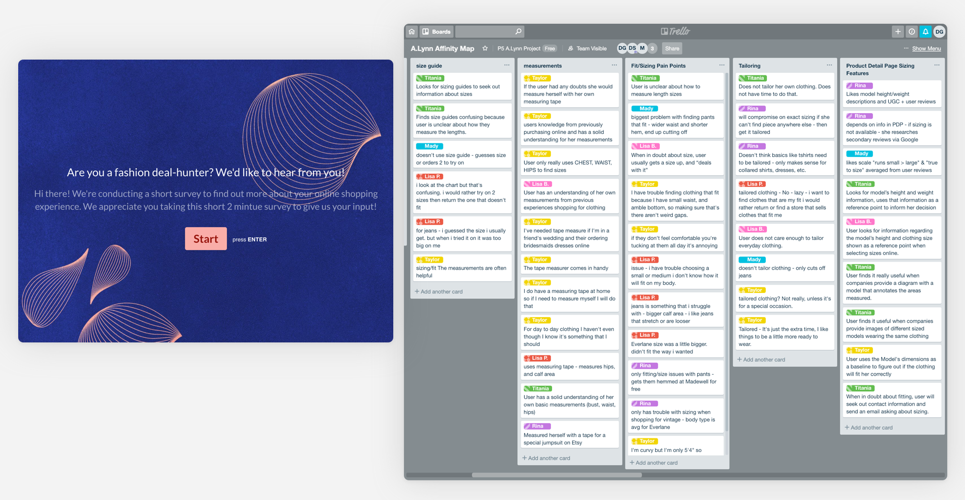
Left: We created our screener survey using Typeform | Right: We used Trello to identify patterns and insights through affinity mapping
Insight: Sending Mixed Messages
Users believed A. Lynn was offering custom-tailored clothing, that fit exactly to the users’ specifications. While A.Lynn does offer more sizing options it does not offer custom tailored clothing to customers. So why weren’t users visiting the site on A. Lynn’s value proposition?
1. The language used in the copy confused users: “Bringing a tailored experience to your front door”.
2. The mannequin and measuring tape imagery used were items users associated with a tailored or custom made clothing.
3. Users were instructed to purchase a “Starter Kit” and use the kit to measure themselves and return to the site to find their corresponding “fit”.
Insight: Losing Credibility
Our users told us they shop online for the connivence and time saved by not having to go to an actual brick and mortar store. They shop online from brands whose sizing information they are familiar with and want information presented to them that is clear and concise. Users want to make purchases confidently and don’t want to any doubts when it comes to their purchases.
4. Users wanted to see general product information at a glance: information on pricing, name, stock and color.
5. Users were overwhelmed by the size chart and unfamiliar with A. Lynn’s measurements.
Clearing the Path to Conversion
We presented our findings to our stakeholder and came to a consensus about focusing our design efforts on messaging and optimizing a path to conversion. We created a new problem statement that helped guide us through our design process:
PROBLEM STATEMENT
How might we design a website for A.Lynn that clearly conveys their value proposition, while providing simple and clear sizing information so that customers have the information they need to make purchases confidently?
Redesign / Solutions

We prioritized creating a clear path to conversion from the moment a user landed on the homepage all the way through to checkout. I lead the re-design on the Home page, Product Gallery and Size Chart.
Home Page Redesign
Based on the user feedback we received, my goal for the Home Page redesign was to clearly display A.Lynn’s value proposition and have an explicit call to action.
Left: A Lynn’s Home page | Right: Proposed Home page redesign
Product Gallery Page Redesign
The Product Gallery page was flagged during our usability testing as a pain point for our users in their flow. My redesign recommendations, although rather traditional, kept the users’ needs at it’s core. It keeps product photography the focus, but includes the information users need to inform their decisions, which includes product pricing, name, and available sizes.
Left: A Lynn’s old Product Gallery page | Right: Proposed Product Gallery page redesign
Size Chart Modal Redesign
We found that when users shop online from an unfamiliar brand, they use different points of reference to identify clothing sizing and fitting. They expect a brand to present it’s sizing information in a clear and concise manner. However, A. Lynn users were overwhelmed and unfamiliar with some of the measurements displayed on A. Lynn’s old size chart. Our client is an expert in the fashion industry and we wanted to ensure we accurately portrayed the sizing specifications, so we invited her to collaborate with us on developing a new size chart. We identified the key information most needed by the user, and highlighted A. Lynn’s other unique sizing offerings and how they are measured. We proceeded to create an entirely new templated system for the size chart, complete with photographic reference and measurement guides.
Left: A Lynn’s old Size Chart modal | Right: Proposed Size Chart redesign

Redesigned wireflow with Hi-Fidelity screens
Results
We conducted an exit survey after conducting usability tests of the current site, and after testing the proposed redesign. Our users perception of the website increased dramatically in terms of a perceived value added, credibility , and delightfulness. The chart below illustrates our findings:

Final Thoughts
Our client approached us initially to validate a potential solution, but was receptive to a user centered approach to the problem. This project taught me the value of including a stakeholder in the design process, especially if they have an unfamiliarity with a user centered design process. The involvement of our stakeholder into our process ensured that my team balanced not only user needs, but also the needs of the business and it’s growth.